YouTube is Testing a Mobile App Redesign That Could Break Your Muscle Memory
YouTube is no stranger to interface overhauls, but its latest design experiment might throw your daily navigation habits for a loop. The platform is currently testing a controversial new mobile layout that removes the dedicated Subscriptions tab from its iconic spot in the bottom navigation bar and early feedback from the user community is decidedly mixed.
For users who rely heavily on chronological feeds to catch up on their favorite content creators, this layout shift fundamentally changes how the app prioritizes content discovery versus user choice.
Where Did the Subscriptions Tab Go?
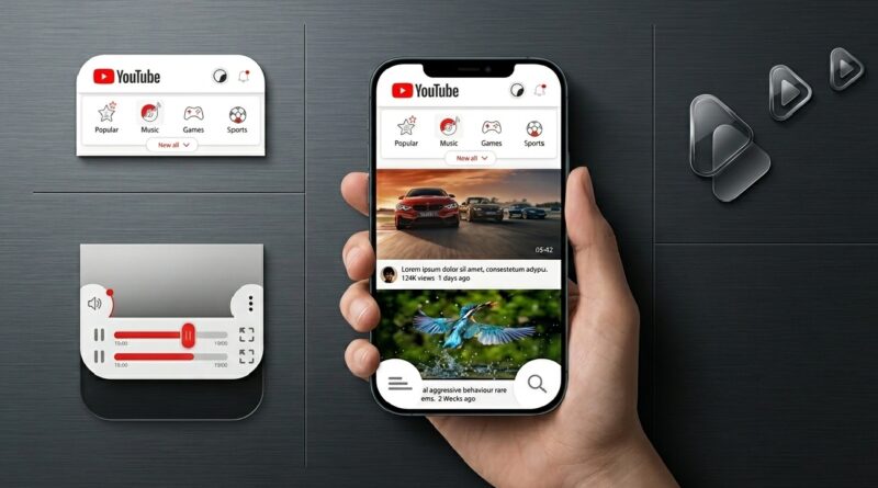
In the current experimental layout, the Subscriptions tab has been evicted from the persistent bottom navigation bar. Instead, it has been relocated to a secondary scrolling menu positioned at the very top of the screen, sitting just below the YouTube logo.Under this design, the Subscriptions button sits alongside familiar top-level feed filters like “Music,” “Gaming,” and “New to You.”
Interestingly, this upper menu also hosts a secondary “Home” button, creating a somewhat redundant experience given that the primary Home tab still anchors the bottom bar. Tapping the relocated Subscriptions option loads your typical list of followed channels, but it no longer enjoys its own standalone real estate.
One-Handed Usability and Modern Smartphone Design
On its face, moving a heavily utilized feature to the top of the app introduces a distinct usability hurdle. Modern smartphones feature ultra-tall aspect ratios, making top-heavy navigation difficult to reach during one-handed use. Users accustomed to a quick thumb tap at the base of their screens will now have to reach across the display just to see their followed feeds.
Beyond accessibility concerns, the rearrangement shifts the app’s underlying priorities. By clearing out the Subscriptions icon, YouTube has transformed the standard central “+” icon into a larger, explicitly labeled “Create” button. The expanded real estate for this feature strongly hints at an upcoming push for advanced, AI-based content creation tools, moving beyond standard camera shortcuts and Shorts uploads to encourage mobile content production.
Will This Layout Roll Out to Everyone?
Fortunately for critics of the design, this layout appears to be confined to a limited A/B testing pool. Users caught in the test group have reported inconsistent behavior, with the layout appearing on primary profiles but vanishing upon restarting the app or switching accounts.Historically, YouTube tests dozens of interface variations annually, measuring user engagement and session lengths before committing to a permanent change.
If a navigation adjustment causes a measurable drop in watch time or increases user frustration, it rarely makes it to a global release. For viewers who prefer curated subscription feeds over algorithmic recommendations, the hope is that user feedback will keep the bottom navigation bar right where it belongs.
Frequently Asked Questions (FAQs)
Did YouTube permanently delete the Subscriptions tab?
No. YouTube is not removing the Subscriptions feed. It is simply running a limited experiment that relocates how users access it on mobile devices.
Why did the bottom navigation bar change on my YouTube app?
Your account has likely been selected for an A/B test. YouTube regularly trials new user interfaces with small percentages of global users to gather performance data before launching updates widely.
What is the purpose of the new “Create” button?
The redesign replaces the compact “+” icon with a prominent, labeled “Create” button. This shift is designed to encourage mobile content creation and give users quicker access to publishing tools and potential AI features.