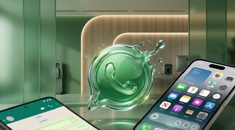
The Liquid Glass Evolution: How WhatsApp’s New Design is Redefining the Modern Chat Interface
For nearly a decade, WhatsApp’s interface remained virtually frozen in time—a reliable, “flat” design that prioritized utility over aesthetics. But with the global rollout of the Liquid Glass interface, the world’s most popular messenger has undergone its most significant visual transformation to date. This shift moves away from the static, boxed-in layouts of the past toward a fluid, translucent, and layered experience.
Here is a look at how the Liquid Glass philosophy differs from the classic design we used for years.
From Static Blocks to Floating Elements
In the legacy design, the WhatsApp interface was defined by “anchored” elements. The message input bar at the bottom and the header at the top were fused to the edges of the screen, creating a rigid, compartmentalized look. The new Liquid Glass approach introduces the Floating Chat Bar. By detaching the text entry field from the bottom edge and rounding its corners, the interface gains a sense of physical weight and depth, making the app feel like a modern piece of software rather than a basic tool.
Translucency and the “Glass” Effect
The most striking difference lies in how the app handles light and layers. The old design relied on solid blocks of color—the iconic WhatsApp Green or deep greys—to separate navigation from content. When you scrolled, messages simply vanished behind these solid walls.
The Liquid Glass interface utilizes Gaussian Blur and Translucency. The navigation bars now act like frosted glass; as you scroll your chat history, the colors and shapes of your messages and wallpaper are faintly visible beneath the header and footer. This creates a “liquid” continuity, making the entire app feel like one cohesive environment rather than a series of separate screens.
Ergonomic Navigation
For years, Android and iOS users had fundamentally different navigation experiences, with Android users reaching for tabs at the top of the screen. The new design has standardized this with a Bottom Navigation Bar. This change acknowledges the reality of modern smartphone hardware—screens are getting taller, and “thumb reach” is a priority. Moving Chats, Updates, Communities, and Calls to the bottom makes the interface significantly more accessible for one-handed use.
High-Contrast Visuals and Refined Accents
The color palette has also seen a sophisticated overhaul. While the old dark mode used a dark navy-grey, the Liquid Glass update utilizes a True Dark palette with higher contrast. This not only looks sharper on OLED screens but also reduces eye strain. Furthermore, the clutter of various blue and grey accents has been replaced by a unified, vibrant “WhatsApp Green,” which serves as the primary focal point for buttons, notification badges, and icons.
Elastic Motion and Physics
Finally, the “Liquid” moniker refers to the app’s new animation engine. The old transitions were functional but “snappy” and dry. The new interface incorporates Spring Physics—when you open a photo, swipe between tabs, or pull down to refresh, the elements move with an elastic smoothness. This responsiveness gives the user tactile feedback, making the digital interaction feel more organic and less mechanical.
The transition to Liquid Glass marks WhatsApp’s departure from being a simple utility to becoming a premium, design-forward platform. It’s a change that proves even the most functional tools can benefit from a little bit of elegance.